Sunday, August 12, 2018

Hellboy Portrait

Still trying to work out Taro's "wet into dry" technique, so far so fun.  Long way to go, but I am enjoying the results of the layered colors, especially on Hellboy's cheeks and nose.  Also, trying out some more new Daniel Smith colors.  This time trying the dark, rich Phthalo Blue and the lighter Cobalt Teal Blue, both used in the background (which I almost did not do; see below for comparison).

Made it thru the first two Hellboy Omnibuses and the Short Stories Omnibus (just bought vol 3).  As I wait for the final two omnibuses, I am reading the BPRD's complete War on Frogs.  What an awesome world Mignolo, John Arcudi, Guy Davis, and the rest of the crew have created.  I think I am going to watercolor portraits of the main cast, starting with Abe Sapien.

                                      Watercolor on 140 lbs paper 4x6


And here it is before painting a background.  I definitely like it with the background better.

Friday, August 10, 2018

Watercolor or Bust

Been trying some new techniques lately.  Marco "Taro" Holmes, who is an amazingly talented watercolor artist has this "wet in dry" technique (wet brush on dry paper, as opposed to wet in wet, where you wet the paper first).  I am constantly in awe of his work.  The technique allows for strong lines, but also beautiful washes that can be built upon each other, taking advantage of the transparent nature of watercolors.

I have tried and failed at it several times.  But with this effort, I think I am beginning to understand what he is teaching.  Below is probably the most watercolor-y painting that I have ever done (based on a google image of a greek statue bust).


                                          Watercolor on 140 lbs paper 9x12

Only used three colors for this, some the newly acquired Daniel Smith watercolor paints: Mayan Dark Blue, Shadow Violet, and Venetian Red.

Sunday, July 29, 2018

Hellboy

Been rereading all the Hellboy books. . .Mike Mignola is a genius.  He is such a masterful storyteller.  I love his use of darks, combined with Dave Stewart's (not that Dave Stewart, the other one) moody and muted colors to create the horror noir that is Hellboy.

So inspired by Mignola, I decided to try my hand at a Hellboy illustration (the tentacled horror is a bit of a swipe. . .).  And I have been wanting/trying to do a comic book style page using watercolors like this one.  Every time I start one, I decide to leave it as ink alone.  This time, however, with the aforementioned inspiration, I was able to make the leap.  


                                  Watercolor and ink 14x10 on 200 lbs paper


And here is the pen and ink drawing before I applied the watercolor over it.  


The inking was done use a folded pen (see below) from Toronto Pen Company.  By varying the angle (and pressure), the nib allows for thin and very thick lines.


Saturday, July 21, 2018

Lion about

Another drawing based on a photo my friends photo safari in Africa.  I was debating whether to sketch it with a folding pen or paint it in watercolors or both (like the Wild African Dog).  I still might paint it, but not for a while.

I really do love Robert Oster Melon Tea. It is a warm sepia with some greenish tints.  Just perfect for loose sketches like this one.

                    Folded Pen and Robert Oster Melon Tea ink 5X7 on 98 lbs paper

Sunday, July 15, 2018

Purple Finch

Initially, I was not happy with this but became quite fond of it after it dried.  The breast of the finch in the reference photo* was much lighter and mostly white.  And while the bird was still wet, it really looked just too dark.  I thought I messed it up.

When it dried, however, the colors lightened up (as watercolor does).  The addition of few strokes of a white gel pen (plus some splashes of blue paint for good measure) helped the contrast and made for quite a striking composition.  I think I like it.


                         Watercolor over pen & ink 7x10 on 140 lbs paper


Same picture in pen and ink before the watercolors were applied.


*Photo reference: Birds & Blooms March 2018 (pg 28; Joe Stambaugh)

Thursday, July 12, 2018

Blue-winged Warbler

Did you know that the Golden-wing Warbler and the Blue-winged Warbler show very little genetic difference?  Of course you did!  That said, I think the reference photo is a Blue-winged Warbler, of course it could be of the hybrid Lawrence's Warber. . .

Not sure when I started painting birds so often, but this one came out quite nicely (the contrast in the colors is not so good in this scan compared to the actual painting).  I really wanted to make the background in this soft and etherial.  So I used masking fluid (see below for what not to do) to protect the bird and the branches.


                                        Watercolor on 140 lbs paper 9x12*

This painting is an example of if at first you do not succeed. . .I originally wanted to do this in my perfect sketch book.  The masking fluid that I used was old and gushed out of the applicator.  The liquid seeped into the fibers of the paper and that temporary masking fluid became permanent.  That green goop is bonded to the paper.  I had to cut that page out of the book because the stuff was still tacky to the touch 5 hours later.


*photo reference: The Cornell Lab of Ornithology 2017 Calendar (July; BN Singh)

Sunday, July 01, 2018

Wild African Dog -- Two Ways

Dingo ate my. . .  ::ahem:: Not a dingo but a wild African dog in Botswana (photo reference below).  I think I captured the dog's pensive, sentinel stare.


                                           Watercolor 7x10 on 90 lbs paper

Below is the same dog done with a folded nib (bought these really cool folded nibs that fit on a standard nib holder; from The Toronto Pen Company) as loose gestural warm up.  If I was smart, I could have done it as a value study, but I am not.  The eyes on this one are more cartoony and I did not quite get the shape of the muzzle and jaw.  However, it was very fun to do and this sketch definitely helped me get things right in the painting. 


                    Pen & Ink (Robert Oster Melon Tea)  7x10 on 90 lbs paper


Couple of doodles using the melon tea ink and light wash as I prepared to do the watercolor.  Not sure where the bird came from.


And here is the photo reference taken by a friend of mine whilst they were in Botswana.


Friday, June 22, 2018

Joker in Dark Lilac

After posting Batman, it was suggested I try my hand at a Joker illustration.  Based on a panel from Dark Knights: Metals #6 (Greg Capullo and Jonathan Glapion killed it) in simple pen and ink.  It has probably been 20 years since I drew the Joker.

Drawn with an Edison Nouveau fountain pen and Lamy Dark Lilac ink (with a touch of green for his hair).  The ink goes from a light lavender to a, well, dark lilac when layered.   And it has a really, really neat green sheen that you can see in the jacket (click on the figure to embiggen', it is difficult to see on the scan).


                                        Pen & Ink on 98 lbs paper 7x10


Here is the very quick gesture drawing in purple pencil (sensing a theme). 

Sunday, June 17, 2018

Bad Anatomy Batman

It started as an exercise to see how much ink my new notebook could handle (a decent amount as it turns out).  However, it did not turn out well for the Dark Knight's anatomy.  Oooph. . I do like the chiaroscuro black and white contrast.

                                    Pen & ink on 98 lbs paper 7x10

Thursday, June 07, 2018

Pure Pure American Look -- Brush Work

Back in the day (see below), I used to draw using a brush.  Finding the old comic book pages has inspired me to start using a dip brush again.  Comparing today's work vs the work I did as a 17, well, I have a long way to go to get back to that level of skill and ease. 


Below is a HS project done in my junior year for Commercial Art class.  We had to draw a fashion figure (hence the elongated proportions of the model; for fashion figures you use 10 head heights vs 7-8 head heights for normal figures) and create a newspaper add to go with it.  This was before computer layout programs, so the lettering was hand drawn using a ruling pen.  All individual images were captured via camera and pasted on card stock where I drew the border (also with ruling pen).  The class was stressful, but I remember how much fun we all had.  The class was 3 hours per day, and aside from all the projects that we worked on, we all created art to impress each other or make each other laugh (like MacGyvering a light box to create a Bat signal to shine into the classrooms across the quad). 


The original figure and advertisement were too big to fit even on my 11x14 sized scanner! 


Monday, May 14, 2018

Congratulations Dr. S!!

This weekend it was my honor to attend my good friend's veterinary school graduation and hooding ceremony.  How else to to congratulate a newly minted veterinarian but with Snoopy and School House Rock (the four-legged zoo of course).  Congratulations Dr. S, you earned it!!   


                  Tombow Dual Brush markers on 140 lbs watercolor paper 6x8


Black and white version


                                                        Test Snoopy

I was not sure how the Tombow brush pens would react to the watercolor paper, so I needed to do a crash test Snoopy.  The "tie-dye" effect was kinda cool.


Tuesday, May 08, 2018

More Envelope Art with School House Rock

With the passing of Bob Dorough, the musical director of School House Rock, last week, several radio stations asked their listeners to describe their favorite song.  I did not remember "Unpack Your Adjectives" until I looked up video on youtube.  My favorite verse is:


We hiked along without care.

Then we ran into a bear.

He was a hairy bear,

He was a scary bear,
We beat a hasty retreat from his lair.
And described him with adjectives!


What is your favorite School House Rock song?
             Pen, brush & ink plus Tombow Dual Brush Markers on 80 lbs no 6 envelope


Ink only version

Friday, May 04, 2018

Is it Spring yet? Or are we going directly to Summer?

I sure hope we did not go from Winter directly to Summer, and skip Spring.  Was really hoping for a few days of warm, not hazy, hot, and humid weather.

So, I had the idea to do a series of Spring-esque version of my neighbor's tree.  Each to be done in watercolor with a different ink.  For this, the first series, I decided to use silver shimmering ink.  It is tough to see in the orange tree (and easiest to see in the purple tree), but each of the inks shimmer when hit with light. Originally, I was going to do these on 6x8 inch 140 lbs watercolor paper and fold them in half to make cards to give out.  Instead, I used the 4x6 and made post cards.  Will probably do a few more using watercolor and sheening inks.  What do you think cool or cheesy?


My neighbor's tree, now in technicolor!


                                      Watercolor and Diamine Citrus Ice ink


                                    Watercolor and Robert Oster Fizzy Lime ink
                                    Watercolor and Robert Oster Violet Clouds ink


Tuesday, May 01, 2018

More Blue Devil. . .and the coming of Shockwave!

If Amazo was a C-lister, than Shockwave is a Z-lister.  He first appeared in Blue Devil #2 (1984; I must have really liked the lovable loser characters back in the day).  At the time I was a big, big fan of the artist Paris Cullins (who launched both Blue Devil in 1984 and Blue Beetle in 1986).  I bought any book he was on and his art probably explains why all the Blue Devil love (did not know, but at that time he had recently graduated the DC comics "internship" program).


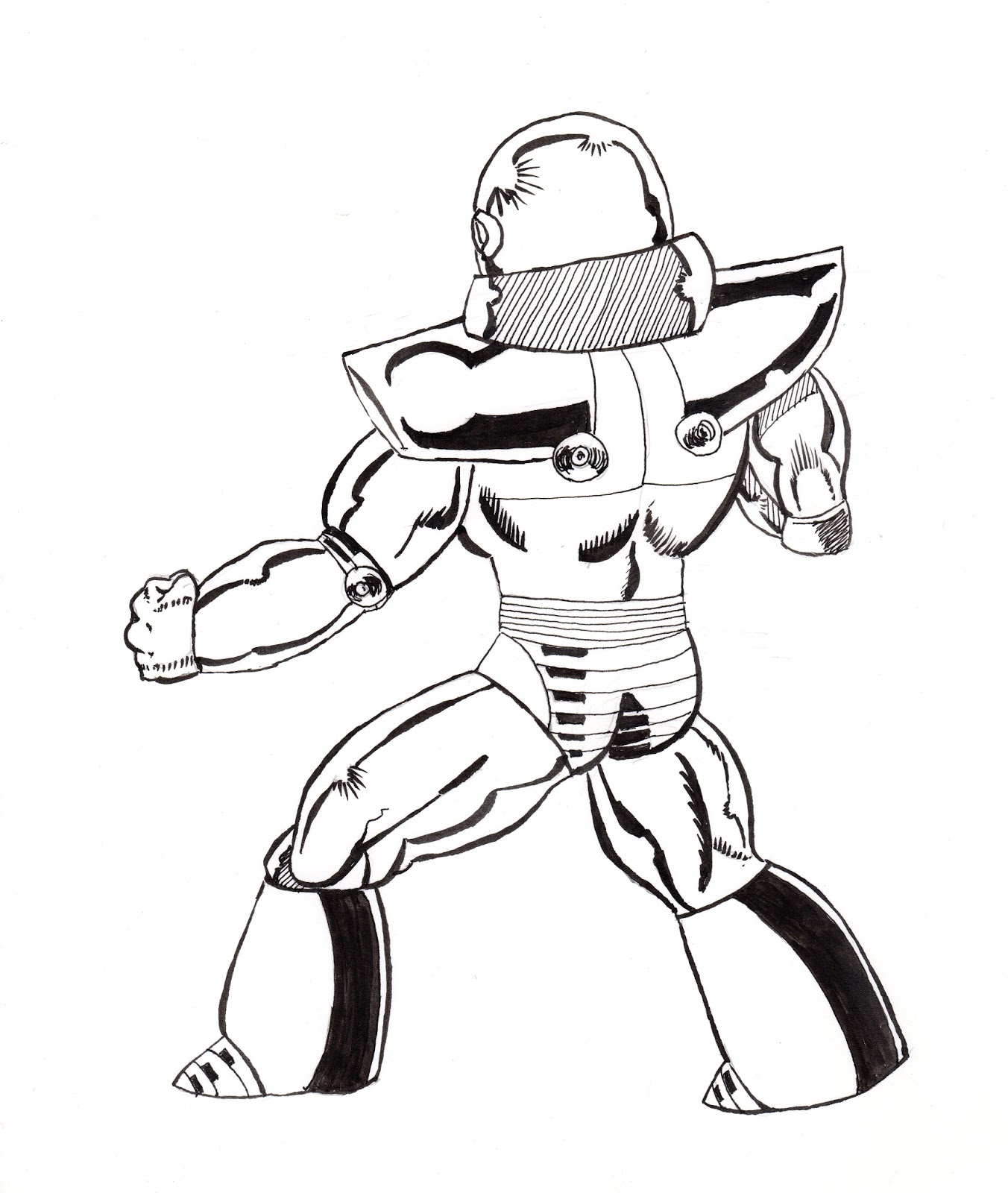
So, I found the other Blue Devil pages I mentioned previously. I must have been 17 or 18 when I drew the pages below.  There is noticable improvement in them compared to the page I did when I was 14 (for starters, there is an actual attempt to add background).  I do not know why I never finished inking, probably because I had no confidence in my ability to ink the buildings.  I am not sure if I will go back and trace/ink these three pages but T really liked "the robot" so I made her a "pin-up" of Shockwave.  We'll see if I ever finish these pages. It was fun to find these.   


Hey look, there is actual background!  Click to embiggen.


Blue Devil ain't doing so hot on this page, he better pick up his game.


There goes our hero!  He rallies back, but how does it end?!?

Sunday, April 22, 2018

Envelopes and Letters

Even though I had not posted anything until late March, I was still doing stuff, just not blog stuff.  Mostly, I was working on my calligraphy by writing letters to friends, trying to stay in touch using a more tactile medium.  And then decorating the envelopes with an illustration or cartoon. The cartoons would be Calvin & Hobbes, Winnie the Pooh, or the Peanuts gang.  Depending on the illustration, I would use either be pen and ink, or some type of watwercolor-esque medium like below. 

Below is a Calvin and Hobbes before I write the name and address on the envelope (I scanned the envelope before I added a few more branches for detail).  These guys are a big, big favorite of mine.


                      Pen & ink and watercolor on 70lbs Sundance envelope


Just the pen and ink.


Wednesday, April 18, 2018

Blue Devil vs Amazo

Recently, I found some old artwork that I did in junior high and high school.  Among this treasure trove was some comic book pages that I did when I was about 14.  I think this penciled page was part of a submission package that I was going to send into DC comics and never did.  The page is a fight between Blue Devil and Amazo (an android who has the combined powers of the Justice League). Neither are particularly famous characters, but back in the day I thought they were cool.

Now that I own a nice portable light box, I decided to trace the original pencils and ink the pages.  Below is the my inks over my pencils.  Pretty cool.

Here is a scan of the original pencils.  Back in the day, I would fill notebooks full of super hero drawings and sketches.  Not bad for a 14 year old!


And here is the tracing from the light box.  I kept the tracing very loose.  It is a bit hard to see.


Wednesday, April 11, 2018

Old Man Logan

Dystopian Wolverine (Old Man Logan) vs dystopian Hulk (Maestro), but neither is from the same dystopian future as the other.  Such is life in the Marvel Universe.

Originally I was going to lay watercolor over these inks, but have decided not to, at least for now.  This is based on a panel by awesome Brazilian artist, Mike Deodato, from Old Man Logan #30.


                              Pen & ink on 90 lbs paper 11x15


Started with a rough pencil sketch.


Decided to do all the details in ink. Cross-hatching is fun!


More details. . .but no trees yet. . .

Wednesday, April 04, 2018

A Self portrait of sorts. . .and other odds and ends

I do not think the reference picture looks like me (plus I was +12 lbs at the time), but it is a funky cool photo.  Just bing watched Season 2 of Jessica Jones and her landlord is a painter and had all kinds of portraits lying around his apartment kinda inspired me to do this one.  May not look like me, but I like it.


                 Pen & Ink + watercolor on 180 lbs Stilman & Birn Beta


A very small copse of evergreen trees just outside my window, just playing around with color and water.  More a doodle than a painting.

                                   Watercolor on paper 5.5 x 3.5 inches


I have seen Leigh Reyes do this to great effect.  This is my first pass at trying it.  Not bad, but I will do better next time.

             Vert de Rio ink (Robert Oster) on 140 lbs watercolor paper (4x6 inches)


Saturday, March 31, 2018

San Francisco in the morning haze

Well, it has been a while since I painted or posted (been doing mostly calligraphy and letter writing).  Here is another in the series, "view from my hotel room".  In this case, San Francisco (you can see the Golden Gate Bridge in the bottom left corner)..  The sky must have changed 20 times in the two days I was there, from clear, to raining to this cool atmospheric cloudy.  I did enjoy the clouds.  Too bad I over worked them to mud.  The cityscape did not turn out half bad. . .


Watercolor on 90 lbs paper 11x17


Details

Sunday, October 08, 2017

Barcelona W

The view from my hotel room at the Barcelona W was not of the Mediterranean but of the bay (I know, poor me).  It was interesting nonetheless, especially at sunset.


                   Watercolor 11 x 8.5 on heavy weight paper 270 gsm

This is bit more abstract than I initially intended and yet it still conveys to me the feeling of sunset. 

I wish I had more time to sketch while there, but between work and the jet lag (and the protest marches), I did not have the time or energy.  As I said before, Barcelona is a great city to sketch.